 Computers: HTML: Style
 Computers: HTML: Style
In the previous stage, you completed your website, which now consists of two pages, and includes lots of words, headings, emphasised words, pictures, a table, two lists, and links.
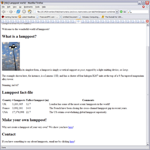 Stage 6b: An external linkindex.html (6b): Click to see the page, or the code.
 The pages work: which is to say that they display all the facts and figures you've put in perfectly clearly. But they are drab.
This is not just electronic vanity. Your persuasive arguments and interesting information are going to make no difference to anyone if no one reads them, and no one will read them if the pages look drab. Subconsciously, people associate dull presentation with dull content, and amateurish web pages with amateurish thinking. This is very unfair, of course - the most brilliant novelist may have the worst handwriting - but prejudices like these have a powerful effect on human behaviour, and you would therefore do well to make your pages as smart and attractive as possible.
This means that you need to think about fonts, colours, and layout. Now when HTML was first designed, it included tags and attributes to control all these things, and you may have noticed that this course hasn't shown you how to use any of them. Well, now you are about to find out why.
 From www.mannyneira.com
One HTML page
Four CSS style sheetsIt is because there is now a better way of doing things, using a new system called Cascading Style Sheets or CSS.
Instead of tinkering with the HTML to change the way a web page is presented, you can use CSS to define a set of rules. These rules can then control the formatting not just of one page, but of any page you choose to apply those rules to.
This technique is called separating form and content, and it brings huge advantages.
Firstly, it greatly simplifies writing HTML, by removing the need to embed dozens of tags and attributes to control formatting. You can concentrate on using HTML to build the content of your website - the words, pictures, tables, lists, and links - and experiment with the style of presentation later.
Secondly, it makes it much easier to give your web pages a consistent appearance. Imagine that you originally designed all your web pages with blue backgrounds: but you later decide they will look better against black. If the colour of your background is built into each HTML page, you'll have to edit them all to change them from blue to black. On the other hand, if they are all displayed according to the same set of CSS rules, you can just change the background colour rule, and all your web pages will be displayed against a nice black backdrop. The bigger your site is, the more helpful this is. www.mannyneira.com has a few hundred pages - big for a personal website, but small by the standards of many corporate or organisational sites - so keeping the formatting and layout centrally controlled helps. But even if your site has only four pages, changing something once is still only a quarter of the effort of changing it four times.
Most introductions to creating your own website show you how to use HTML's formatting tags and attributes, and then tell you to learn CSS later. The problem is that by then, you've already built a site completely in HTML, and to implement CSS you'd have to redo much of your work. Start using CSS from the outset.
 A CSS stylesheet is just a plain text file with a name ending in
 .css, much like a HTML web page is an plain text file with a name ending in .html. You can use the same text editor to create them both.
Each stylesheet contains a series of rules, and each rule takes the form...
selector { property: value; property-2: value; ... }
The selector determines which tags the rule applies to, and is usually just the name of a tag, less the < and > symbols. For instance, if the selector was p, the rule would apply to all <p> tags: or in other words, to all paragraphs.
 Such rules can be written all on one line, or broken across several lines as above, it makes no difference as long as the punctuation is all in place. For example:
p

{

font-family: georgia;

font-size: 10pt;

}
This rule tells a browser that the <p> or paragraph tag should be displayed with a font-family property of georgia, and a font-size property of 10pt (10 point).
Each rule can set an indefinite number of properties, and each stylesheet can contain an indefinite number of rules, so as you can imagine, stylesheets can vary dramatically in length. However, in principle, you've seen it all: stylesheets are just long lists of rules like this one.
 Four special forms of selector are worth knowing about.
The first is a combined selector. For instance, the rule p, li { ... }, would apply to all <p> or paragraph tags, and all <li> or list item tags.
The second is the nested selector. This allows you to choose one tag only when it appears within another tag. If, say, you wished to create a rule for links which appeared in lists, but not elsewhere, you could write li a { ... }. Thus, if the <a> or link tag appeared within a <li> or list item tag, the rule would apply - but <a> tags outside lists would not be affected.
The third is the id selector. This uses the # character, and allows you to specify which tag you wish to apply the rule to by its id attribute. By way of example, the rule div#motto { ... } only applies to divisions with id="motto".
Finally comes the class selector. This uses a dot, and allows you to specify which tag you wish to apply the rule to by its class attribute. By way of example, the rule span.lamppost { ... } only applies to spans with class="lamppost".
These selectors can appear complicated, but used and combined cannily, they will allow you to specify very broad or very narrow applicability for your rules, depending on your needs. As usual, a little practise soon makes them second nature, and you will have created a number of rules using selectors like these before you've finished Lamppost world.
 Having used the
 font-family property as an example above, it's probably worth discussing the choice of fonts for your web page, because it raises a few issues.
You are probably used to using a word processor, which lets you write your text in any of a list of fonts. You just highlight the text you wish to format, click a button to display a list of fonts, and choose one. The text is instantly converted into that font. If you print the document out, or send it to someone attached to an email, your choice of fonts is preserved.
Unfortunately, things are not quite as simple when you are designing a web page. You can use the font-family property to specify which font you wish to use for a tag, and in principle, you can name any font you like, so you could choose any font from the list you see so often in your word processor. The problem is that not all computers have the same fonts that yours has, and (worse still) even when they do, they don't always call them by the same name.
Let's say you choose your favourite font and specify font-family: "Obscuro Blotchy";. When you display your web page on your computer, your text will be displayed in Obscuro Blotchy, just as you intended. Unfortunately, if any of your readers don't have the font Obscuro Blotchy installed on their computer, then they will only see a boring, 'default' font. It could make your page look completely different.
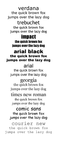 There are two things you can do to mitigate the problem. Firstly, there is a list of nine fonts which are fairly 'web safe', as almost all computers have them - though sometimes under different names. As far as possible, stick to these.
Secondly, using the font-family property, you can specify a list of fonts, separated by commas. If your reader's browser does not have the first, it'll try the second, and it'll keep going until it finds one it does have, or it reaches the end. Take advantage of this, so that if a browser cannot find your first choice font, it can at least have a stab at finding your second choice. At the end of this list, you can specify a 'general' font, which should at least control which kind of 'default' font the browser chooses if the worst comes to the worst: the possible general fonts are serif, sans-serif, cursive, fantasy, and monospace.
Combining these bits of advice would lead you to use one of the following nine font-family definitions in most situations:
font-family: verdana, arial, helvetica, sans-serif;
font-family: trebuchet, arial, helvetica, sans-serif;
font-family: impact, arial, helvetica, sans-serif;
font-family: "arial black", arial, helvetica, sans-serif;
font-family: arial, helvetica, sans-serif;
font-family: georgia, "times new roman", times, serif;
font-family: "times new roman", times, serif;
font-family: "comic sans", cursive;
font-family: "courier new", courier, monospace;
(Note that font names which contain spaces are written between quotation marks).
If you are determined to put your beloved Obsuro Blotchy font at the front of one of these lists, then check to see how your pages look using the second choice font, because that is how some people (and in the case of Obscuro Blotchy, perhaps most people), are going to see it.
Having learnt something about CSS rules, you now need to apply them to your website.
The first step is to create your stylesheet file. Open your text editor, and type in the following:
p

{

font-family: georgia, "times new roman", times, serif;

font-size: 10pt;

}
Then save this under file name styles.css.
This is itself, though, makes no difference to index.html or instructions.html. If you want a browser to apply this stylesheet to these pages, you will have to link the pages to the stylesheet.
Edit each in turn, and under the line near the top which specifies the <title>, add this line:
<link rel="stylesheet" href="styles.css">
Now, if you reopen your pages... you may not immediately notice the difference. The <p> paragraphs of text should now be being displayed in the Georgia font, but Georgia may not be very different to the default font your browser was using before! If this is so in your case, then all I can say is bear with me, because you will soon begin to notice far more dramatic differences.
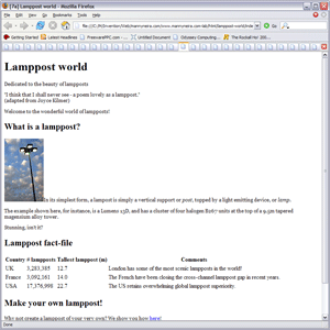 Stage 7a: Georgia (serif) plain textindex.html (7a): Click to see the page, or the code.
It would be useful to apply special formatting to the motto at the top of each page to distinguish it it from the other text. To refresh your memory, here is the fragment of HTML in the file index.html in which the motto appears:
<div id="motto">

  <p>Dedicated to the beauty of lampposts</p>

  <p>"I think that I shall never see - a poem lovely as a lamppost."

  <br>(adapted from Joyce Kilmer)</p>

</div>
The problem here is that you cannot just use an ordinary p { ... } type rule, because the p selector would affect all the paragraphs on the page.
The rule you need to format the motto paragraphs looks like this: div#motto p { ... }.
The selector div#motto p uses two techniques explained above. div#motto simply specifies the division in which id="motto", and following it with a p in the same selector refers to those <p> tags within this division.
Add the following rule to the bottom of styles.css:
div#motto p

{

font-size: 16pt;

font-style: italic;

color: blue;

text-align: right;

}
Also, it would be useful to distinguish lamppost model numbers by special formatting. At present, there is only one, but by establishing an appropriate rule, it can be used whenever new model numbers are quoted in the future: and doubtless the Lamppost word will eventually quote many.
Again, a quick look back at the index.html file reveals the following HTML quoting the lamppost model number:
<span class="lamppost">Lumens 13D</span>
The selector required to apply a rule to this span is span.lamppost, so add the following to styles.css:
span.lamppost

{

font-family: "courier new", courier, monospace;

font-size: 10pt;

color: green;

}
Save the modified styles.css file and reopen index.html. This time, the differences should be more striking. The motto paragraphs will be in large blue italics, and right justified, and the lamppost name Lumens 13D will be in a green typewriter style font.
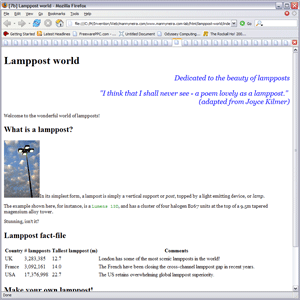 Stage 7b: Blue italics for the mottoindex.html (7b): Click to see the page, or the code.
The headings are to be displayed in Verdana, or at least the nearest available sans-serif font. Add the following lines to styles.css:
h1, h2

{

font-family: verdana, arial, helvetica, serif;

}
Note that the selector h1, h2 will ensure that this choice of font is applied to both the main heading, and the subheadings.
Let us choose a large font for the main heading, and one somewhere between the size of the main heading and the size of the paragraph text (set to 10pt above) for the subheadings. Add the following lines to styles.css:
h1

{

font-size: 20pt;

}
h2

{

font-size: 14pt;

}
Note that this means that the same tag may appear in any number of selectors, and many rules may apply to a single tag. Here, both main headings and subheadings use the same font-family, so this could be set jointly; but they have different values of font-size, so this had to be set for each tag individually.
Make sure you have saved any changes to styles.css, then redisplay index.html. You should a marked difference in the styling of the headings.
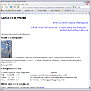 Stage 7c: Verdana (sans-serif) headingsindex.html (7c): Click to see the page, or the code.
In order to help to differentiate the table from the rest of the page, the information in the table will be shown in the typewriter-like font Courier New. Add the following lines to the end of styles.css:
th, td

{

font-family: "courier new", courier, monospace;

font-size: 10pt;

}
The table headers will also be shown in blue text instead of black:
th

{

color: blue;

}
Once again, be sure that you have saved these changes in styles.css, and then redisplay the index.html.
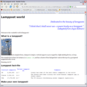 Stage 7d: Courier (monospaced) tableindex.html (7d): Click to see the page, or the code.
During the discussion of lists, it was explained that the <li> or list item tags in an ordered list will be automatically numbered by the browser when a page is displayed. However, the numbering scheme was not mentioned. Generally, by default, a browser will number items 1, 2, 3.... However, you can control the numbering scheme using the CSS property list-style-type, which can take the following values:
decimal 1, 2, 3, 4, 5...
decimal-leading-zero 01, 02, 03, 04, 05...
lower-roman i, ii, iii, iv, v...
upper-roman I, II, III, IV, V...
lower-alpha a, b, c, d, e...
upper-alpha A, B, C, D, E...
If the list is unordered, each item is prefixed by a 'bullet' rather than a number. The type of bullet is also controlled by the CSS property list-style-type, which can be disc, circle or square.
In this case, apply upper case Roman numbers by adding the following to the bottom of styles.css:
ol

{

list-style-type: upper-roman;

}
To give the lists a more informal look, and again to differentiate them from the main text, they will be displayed using the handwriting style font Comic Sans. Add:
li

{

font-family: "comic sans", cursive;

font-size: 10pt;

}
Save styles.css and this time display instructions.html in your browser. As well as noting the new list numbering scheme, and the font used to display the list items, you should also note that the styling applied to the headings, mottos, and ordinary text is all reflected in instructions.html in exactly the same way as it is in index.html: because they are both 'linked' to the same stylesheet. This is an illustration of the efficiency which using stylesheets to control the presentation of multiple pages can bring.
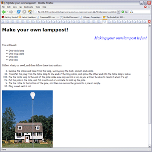 Stage 7e: Comic sans (cursive) listsindex.html (7e): Click to see the page, or the code.
By default, browsers will apply their own choice of special colours to links: and distinguish in colour between links that have been visited and links that haven't been. Personally, I prefer to style links the same way regardless: the distinction in link colours is as likely to confuse readers as to help them. Add the following to the end of styles.css to make all links a nice, bright red:
a

{

color: red;

}
One clever touch in CSS is that it allows you to attach a different style to a link when the a mouse pointer is actually hovering over it. This creates the impression that the links are 'responsive' to the mouse, and is an excellent way of signalling that they can be clicked on. On this page, as a mouse pointer hovers over the links, the text of the link will be displayed in bold. Once again, add the following to the end of styles.css.
a:hover

{

font-weight: bold;

}
Make sure you have saved the changes to styles.css, redisplay index.html in your browser, and at the bottom of the page, check that the links are now shown in red. Finally, move your mouse pointer over the links without clicking on them, and note the way the text becomes bolder as it passes. What could be more inviting than to click such links?
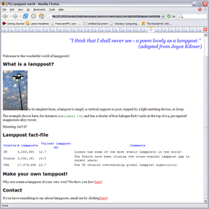 Stage 7f: Red linksindex.html (7f): Click to see the page, or the code.
Now, turn to 8 layout to find out how to position elements on your web page.